
CMS Guide
Table of Contents
- Style Management
- CMS Page Templates
- Working With Custom HTML Modules' Content Editors (WYSIWYG)
- General Tips/Advice for CMS Users
- Additional Notes
- Section Guide
Style Management
The following labels refer to styling options/classes in the "STYLE" dropdown menu located in the toolbar in every Custom HTML Module's content editor.
Headlines:
Headline XXL
Headline 1
Headline 2
Headline 3
Headline 4
Body copy 18px NotoSans
Lorem ipsum dolor sit amet, consectetur adipiscing elit. Vivamus laoreet, purus sed viverra finibus, ligula sapien pretium nisi, at facilisis augue leo et nisl. Proin vulputate, lectus in aliquam fermentum, justo felis luctus odio, ac fermentum ex ligula ac justo. Sed a nibh in odio pulvinar vehicula nec vel purus. Nullam pharetra metus eget odio gravida, non convallis justo hendrerit.
Fonts:
font-NotoSans
font-NotoSans-Italic
font-NotoSans-Light
font-NotoSans-LightItalic
font-NotoSans-Bold
font-NotoSans-BoldItalic
font-NotoSans-BoldCondTwenty
font-NotoSans-BoldCondTwentyItalic
font-NotoSans-Condensed
font-NotoSans-CondensedItalic
font-NotoSans-StdExtended
font-NotoSans-StdBoldExtended
Default pallet
#000000 Black
#ffffff White
#cccccc Accent
#535456 Text
#cc0000 Red
Brand colors
#007eb9 Blue
#84c5ed Soft Blue
#c8e2f7 Pale Blue
#37a8e0 Light Blue
#00559d Deep Blue
#002e63 Dark Blue
Primary Gradient
Links
Link BlueLink DarkBlue
Link Blue Chevron
Link DarkBlue Chevron
Buttons
CMS Page Templates
What CMS page templates are available to create new pages with?
The following CMS page templates are available in the "CMS Primary Theme" theme:
Working With Custom HTML Modules' Content Editors (WYSIWYG)
How do I replace placeholder ("lorem ipsum") or unwanted text content?
The content editor can be finicky. To replace placeholder or unwanted text, we recommend that you first click the “BLOCKS” button in the toolbar to reveal outlines surrounding block-level elements. Then, select the text you wish to replace and type in your desired text. Or, you can place your cursor at the end of the text you want to replace, add your desired text, and then select and delete the placeholder text preceding it. We do NOT recommend selecting all placeholder text in the editor and deleting it before you add your desired content. As a result you may accidentally erase necessary markup that the content depends on. It is always best to edit text elements one at a time rather than deleting everything you don’t want from the start.
Can I copy/paste from other sources?
Be very careful when copy/pasting text content from other sources into a Custom HTML module's content editor. When copying from an external document, take steps to ensure the text you are copying is plain text (as opposed to rich text.) When copying from a web page, make sure you are ONLY including text and not actual HTML tags (<p>, <br>, etc.) as this could result in unintended styling/format inconsistencies.
How do I change the appearance of text content (color, font size, etc)?
The “STYLE” dropdown in the toolbar can be used to edit the styling/appearance of content. Keep in mind that when you add a style from the dropdown, it does not overwrite other styles previously applied to the element. This allows greater flexibility in cases where you may need more than one syle applied, but you will need to remember to uncheck undesired styles after applying them.
Please refer to Style Management for examples of classes/styles you may apply.
Keep in mind that changing the appearance or styles of text should be done SPARINGLY - for the sake of consistency across pages, it is best to stick with the module's default styling whenever possible.
How do I add/edit a link?
The "insert/edit link" button in the toolbar is used to create and modify links:
- To create a new link, type your desired link text within the content editor, select it, and then click the "insert/edit link" button. This may be tricky if you're creating a new link next to an already-existing link. To do this, place your cursor at the end of the existing link's text and then press the right arrow key, so your cursor is outside the existing link. Then, type the new link's text, select it and click the "insert/edit link" button.
- To modify an existing link, click into the middle of the link text within the content editor, then click the "insert/edit link" button.
How do I add/edit an image?
The "asset picker" button in the toolbar allows you to add images into the content editor. To modify an existing asset, click the asset and then click the "asset picker" button. Not all custom HTML modules were made with the intent to have an image placed in them. (Tip: If your default placeholder content did not contain an image, you should avoid adding one with this tool.)
Note: If you're including an image in a Custom HTML module, remember to consider the image alt text (which is editable through the "asset picker" button), and include a value when necessary. For more details, see "Do I need to update/include alt text for every image?" in General Tips/Advice for CMS Users.
How do I add a code snippet?
The "insert code snippet" button in the toolbar adds pre-made snippets of code into the content editor. Note that code snippets are primarily (but not always) used as a way to revert either the entire content of a Custom HTML Module to its default state, or to revert a part of its content to its original state. For example, if you accidentally delete the headline and byline at the top of the Custom HTML Module included in Section 1, you can use a code snippet to add it back in. In most cases you will not need to use code snippets unless you're attempting to "fix" a module (i.e. bring back original content which was since removed.)
General Tips/Advice for CMS Users
How can I ensure that my content will be accessible to all users?
Be sure to follow all recommendations and instructions given in this guide, particularly the recommendations involving link text, image alt text, and heading levels. To learn more about accessibility, please see Accessibility for Radancy CMS Publishers.
Additional Notes
How can I add to or update the notes to this section?
Find this section (title: "CMS Guide Info") in your section list and edit its "CMS Guide Info - Copy" module to add as many notes as you'd like right here. Be careful to not delete any of the content above or below your notes!
Section Guide
Before using a section from this guide, please read the corresponding documentation for that section. Documentation is found above each section in this guide, on a black background.
Note that section titles are color coded based on which menu they can be found in after clicking the "add section" button on any page:
Red - find this section in the "Use Existing" Menu.
Green - find this section in the "Add New" Menu.
Keep in mind that when you edit a section from the "Use Existing" Menu, you are editing every instance of that section. Sections added via the "Add New" Menu are safe to be edited freely, as a new instance of the section is created everytime it is added to a page.
CP Banners - Image Background (Section 2)
Suggested Use: Content Page Banner
Image Size and Quality: Users can upload images. Ensure images are of high quality and optimized for web use.
For mobile devices, recommended sizes are 750x1334 (9:16 ratio)
For desktop, recommended sizes are 1920x1080 (16:9 ratio) and 1280x720 (16:9 ratio).
Title (h1) 页面标题

CP Banner - Blue Gradient Background (Section 2a)
Suggested Use: Content Page Banner
Image Size and Quality: Users can upload images. Ensure images are of high quality and optimized for web use.
For mobile devices, recommended sizes are 750x1334 (9:16 ratio)
For desktop, recommended sizes are 1920x1080 (16:9 ratio) and 1280x720 (16:9 ratio).
Title (h1) 页面标题

Spotlight Text 2 Col (Section 6)
Suggested Use: shorter copy
Headline (h2) 标题
Lorem ipsum dolor sit amet, consectetur adipiscing elit. Sed eiusmod tempor incididunt ut labore et dolore magna aliqua. Ut enim ad minim veniam, quis nostrud exercitation ullamco laboris nisi ut aliquip ex ea commodo consequat. Duis aute irure dolor reprehenderit voluptate velit esse cillum dolore eu fugiat nulla pariatur.
2 Split - Right Image - Left Heading - Copy - CTA Button (Section 7)
Suggested Use: N/A
Image Size and Quality: Users can upload images. Ensure images are of high quality and optimized for web use.
For this section:
For mobile devices, we recommend 9:16 aspect ratio sizes like 750x1334 and 1080x1920.
For desktop, the recommended sizes are 960x540 and 1280x720, both maintaining the 16:9 ratio.
Text Content: Use the WYSIWYG to add and edit text content
Style Management: The style of text and buttons within this section can be customized through the WYSIWYG editor.
Accessibility: If the image is not purely decorative and convey a message, please provide a descriptive alt text for the image. This ensures accessibility for users with visual impairments, allowing screen readers to convey the content and context of the image effectively. For more information, refer to WCAG 2.1, Success Criterion 1.1.1: Non-text Content.
Headline (H2)
Lorem ipsum dolor sit amet, consectetur adipiscing elit, sed do eiusmod tempor incididunt ut labore et dolore magna aliqua. Ut enim ad minim veniam, quis nostrud exercitation ullamco laboris nisi ut aliquip ex ea commodo consequat. Duis aute irure dolor in reprehenderit in voluptate velit esse cillum dolore eu fugiat nulla in culpa qui officia deserunt mollit anim id est laborum. a commodo consequat.

2 Split - Left Image - Right Heading - Copy - CTA Button (Section 7a)
Suggested Use: N/A
Image Size and Quality: Users can upload images. Ensure images are of high quality and optimized for web use.
For this section:
For mobile devices, we recommend 9:16 aspect ratio sizes like 750x1334 and 1080x1920.
For desktop, the recommended sizes are 960x540 and 1280x720, both maintaining the 16:9 ratio.
Text Content: Use the WYSIWYG to add and edit text content
Style Management: The style of text and buttons within this section can be customized through the WYSIWYG editor.
Accessibility: If the image is not purely decorative and convey a message, please provide a descriptive alt text for the image. This ensures accessibility for users with visual impairments, allowing screen readers to convey the content and context of the image effectively. For more information, refer to WCAG 2.1, Success Criterion 1.1.1: Non-text Content.
Headline (H2)
Lorem ipsum dolor sit amet, consectetur adipiscing elit, sed do eiusmod tempor incididunt ut labore et dolore magna aliqua. Ut enim ad minim veniam, quis nostrud exercitation ullamco laboris nisi ut aliquip ex ea commodo consequat. Duis aute irure dolor in reprehenderit in voluptate velit esse cillum dolore eu fugiat nulla in culpa qui officia deserunt mollit anim id est laborum. a commodo consequat.
Content box Left Full-width BG (Section 8)
Suggested Use: N/A
Image Size and Quality: Users can upload images. Ensure images are of high quality and optimized for web use.
For mobile devices, recommended sizes are 750x1334 (9:16 ratio)
For desktop, recommended sizes are 1920x1080 (16:9 ratio) and 1280x720 (16:9 ratio).
Text Content: Use the WYSIWYG to add and edit text content
Style Management: The style of text and buttons within this section can be customized through the WYSIWYG editor.
Accessibility: If the image is not purely decorative and convey a message, please provide a descriptive alt text for the image. This ensures accessibility for users with visual impairments, allowing screen readers to convey the content and context of the image effectively. For more information, refer to WCAG 2.1, Success Criterion 1.1.1: Non-text Content.
Headline (H2)
Lorem ipsum dolor sit amet, consectetur adipiscing elit, sed do eiusmod tempor incididunt ut labore et dolore magna aliqua. Ut enim ad minim veniam, quis nostrud exercitation ullamco laboris nisi ut aliquip ex ea commodo consequat. Duis aute irure dolor in reprehenderit in voluptate velit esse cillum dolore eu fugiat nulla in culpa qui officia deserunt mollit anim id est laborum. a commodo consequat.
Image - Copy - BG white 2 Col (Section 9)
Suggested Use: N/A
Image Size and Quality: Users can upload images. Ensure images are of high quality and optimized for web use.
Recommended minimum size is 564 × 342 px
Text Content: Use the WYSIWYG to add and edit text content
Style Management: The style of text and buttons within this section can be customized through the WYSIWYG editor.
Accessibility: If the image is not purely decorative and convey a message, please provide a descriptive alt text for the image. This ensures accessibility for users with visual impairments, allowing screen readers to convey the content and context of the image effectively. For more information, refer to WCAG 2.1, Success Criterion 1.1.1: Non-text Content.

Headline (H2)
Lorem ipsum dolor sit amet, consectetur adipiscing elit. Vivamus laoreet, purus sed viverra finibus, ligula sapien pretium nisi, at facilisis augue leo et nisl. Proin vulputate, lectus in aliquam fermentum, justo felis luctus odio, ac fermentum ex ligula ac justo. Sed a nibh in odio pulvinar vehicula nec vel purus. Nullam pharetra metus eget odio gravida, non convallis justo hendrerit.
CMS Guide - Video - Copy - BG white 2 Col (Section 9a))
Suggested Use: N/A
Image Size and Quality: Users can upload images for a video thumbnail. Ensure images are of high quality and optimized for web use.
Recommended minimum size is 564 × 342 px
Text Content: Use the WYSIWYG to add and edit text content
Style Management: The style of text and buttons within this section can be customized through the WYSIWYG editor.
Accessibility: If the image is not purely decorative and convey a message, please provide a descriptive alt text for the image. This ensures accessibility for users with visual impairments, allowing screen readers to convey the content and context of the image effectively. For more information, refer to WCAG 2.1, Success Criterion 1.1.1: Non-text Content.
Headline (H2)
Lorem ipsum dolor sit amet, consectetur adipiscing elit. Vivamus laoreet, purus sed viverra finibus, ligula sapien pretium nisi, at facilisis augue leo et nisl. Proin vulputate, lectus in aliquam fermentum, justo felis luctus odio, ac fermentum ex ligula ac justo. Sed a nibh in odio pulvinar vehicula nec vel purus. Nullam pharetra metus eget odio gravida, non convallis justo hendrerit.
Related Content Bg White-Blue (Section 10)
Suggested Use: Use this section when you want to handpick which pages to feature in the related content section.
Lorem ipsum dolor
Lorem ipsum dolor sit amet, consectetur adipiscing elit, sed do eiusmod tempor incididunt ut labore et dolore magna aliqua. Ut enim ad minim veniam, quis nostrud exercitation ullamco laboris nisi ut aliquip ex ea commodo consequat. Duis aute irure dolor in reprehenderit in voluptate velit esse cillum dolore eu fugiat nulla in culpa qui officia deserunt mollit anim id est laborum. a commodo consequat.
-

Header Lorem Ipsum
Lorem ipsum dolor sit amet, consec tetur adipiscing ut enim ad minim veniam, quis nostrud
-
Header Lorem Ipsum
Lorem ipsum dolor sit amet, consec tetur adipiscing ut enim ad minim veniam, quis nostrud
-
Header Lorem Ipsum
Lorem ipsum dolor sit amet, consec tetur adipiscing ut enim ad minim veniam, quis nostrudx
Note To Developer: Please include documentation for this section!
相关内容

Stories 2 Col (Section 11)
Suggested Use: Use this section when you want to handpick via dropdown which pages to feature.
Title (h2)
Lorem ipsum dolor sit amet, consectetur adipiscing elit. Sed do eiusmod tempor incididunt ut labore et dolore magna aliqua. Ut enim ad minim veniam, quis nostrud exercitation ullamco laboris. Nisi ut aliquip ex ea commodo consequat. Duis aute irure dolor in.
Key Facts Number Spin (Section 12)
Suggested Use: N/A
Image Size and Quality: Users can upload icon images. Please resize images to fit this module.
Text Content:
- Thumbnail Alternative Text: Enter the numeric value in this field.
- Short Description: This serves as the title.
- Link Text: This field provides additional information about the module.
The module has been adapted for this use and to be dynamic, allowing all numbers to spin for one second upon scrolling.
Headline (h2) 标题
-
Num 1 Lorem ipsum dolor sit amet Lorem ipsum dolor sit amet, consectetur adipiscing elit. Vivamus laoreet, purus sed viverra finibus, ligula sapien.

-
Num 2 Lorem ipsum dolor sit amet Lorem ipsum dolor sit amet, consectetur adipiscing elit. Vivamus laoreet, purus sed viverra finibus, ligula sapien.
-
Num 3 Lorem ipsum dolor sit amet Lorem ipsum dolor sit amet, consectetur adipiscing elit. Vivamus laoreet, purus sed viverra finibus, ligula sapien.
Multi Item (Section 21)
Suggested Use: Pages are selected using a Content Page Display module. Copy intro can be edited with WYSIWYG.
Headline (h2)
Lorem ipsum dolor sit amet, consectetur adipiscing elit. Vestibulum aliquet risus vitae ante tincidunt semper. Aenean laoreet, nibh et posuere egestas, orci neque gravida risus, non rhoncus nunc mauris ac enim.
-

Callout Link Text
Lorem ipsum dolor sit amet, consectetur adipiscing elit. Nulla bibendum sit amet ex iaculis ornare.
-

Callout Link Text
Lorem ipsum dolor sit amet, consectetur adipiscing elit. Nulla bibendum sit amet ex iaculis ornare.
-
Callout Link Text
Lorem ipsum dolor sit amet, consectetur adipiscing elit. Nulla bibendum sit amet ex iaculis ornare.
-
Callout Link Text
Lorem ipsum dolor sit amet, consectetur adipiscing elit. Nulla bibendum sit amet ex iaculis ornare.
-
Callout Link Text
Lorem ipsum dolor sit amet, consectetur adipiscing elit. Nulla bibendum sit amet ex iaculis ornare.
-
Callout Link Text
Lorem ipsum dolor sit amet, consectetur adipiscing elit. Nulla bibendum sit amet ex iaculis ornare.


Multi Item (Section 21a)
Suggested Use: Pages are selected using a Content Page Display module. Copy intro can be edited with WYSIWYG.
Headline (h2)
Lorem ipsum dolor sit amet, consectetur adipiscing elit. Vestibulum aliquet risus vitae ante tincidunt semper. Aenean laoreet, nibh et posuere egestas, orci neque gravida risus, non rhoncus nunc mauris ac enim.
-
Callout Link Text
Lorem ipsum dolor sit amet, consectetur adipiscing elit. Nulla bibendum sit amet ex iaculis ornare.
-
Callout Link Text
Lorem ipsum dolor sit amet, consectetur adipiscing elit. Nulla bibendum sit amet ex iaculis ornare.
-
Callout Link Text
Lorem ipsum dolor sit amet, consectetur adipiscing elit. Nulla bibendum sit amet ex iaculis ornare.
-
Callout Link Text
Lorem ipsum dolor sit amet, consectetur adipiscing elit. Nulla bibendum sit amet ex iaculis ornare.
Slider (Section 22)
Suggested Use: The slider module is not CMS-able. The content is located in the layout of the module and needs a developer update or add a new version.
-
备受认可的工作
循环经济
贵金属、PET或稀土——我们创新的回收技术对环境有可持续的影响。
-
备受认可的工作
挽救生命
贺利氏在心脏起搏器方面的创新确保心脏以正确的节奏跳动。
-
备受认可的工作
提高电动汽车效率
贺利氏基板可延长电动汽车中电子设备的使用寿命。
-
备受认可的工作
l更可持续的钢铁
以传感器技术,赋能更可持续的钢铁生产


Multi Item (Section 23)
Suggested Use: Pages are selected using a Callout Action Link module. Copy intro can be edited with WYSIWYG.
Headline (h2)
Lorem ipsum dolor sit amet, consectetur adipiscing elit. Vestibulum aliquet risus vitae ante tincidunt semper. Aenean laoreet, nibh et posuere egestas, orci neque gravida risus, non rhoncus nunc mauris ac enim.

Multi Item (Section 24)
Code Snippet: Section 24 - Image / Heading / Copy / CTA
Text Content: Use the WYSIWYG to add and edit text content
Headline (h2)
Title (h3)
Our activities as an employer are closely linked to the Heraeus vision. “We are powered by our people” is an established principle for us.
Learn moreTitle (h3)
Our activities as an employer are closely linked to the Heraeus vision. “We are powered by our people” is an established principle for us.
Learn moreTitle (h3)
Our activities as an employer are closely linked to the Heraeus vision. “We are powered by our people” is an established principle for us.
Learn moreTitle (h3)
Our activities as an employer are closely linked to the Heraeus vision. “We are powered by our people” is an established principle for us.
Learn moreMulti Item (Section 25)
Code Snippet: Section 25 - Icon / Headline / Copy / CTA
Text Content: Use the WYSIWYG to add and edit text content
Image Content: Use the WYSIWYG to add and edit IMAGE- icons—75px by 75px is the recommended size.
Heading (h2)
Lorem ipsum dolor sit amet, consectetur adipiscing elit, sed do eiusmod tempor incididunt ut labore et dolore magna aliqua. Ut enim ad minim veniam, quis nostrud exercitation ullamco laboris nisi ut aliquip ex ea commodo consequat. Duis aute irure dolor in reprehenderit in voluptate velit.
Slider (Section 26)
Suggested Use: The slider module is not CMS-able. The content is located in the layout of the module and needs a developer to update or add a new version.


Multi Item (Section 29)
Suggested Use: Use the WYSIWYG to add and edit text content for both intro and items
De...
-
Lorem ipsum dolor sit amet, consectetur adipiscing elit. Nulla auctor eros suscipit hendrerit viverra. Sed sit amet neque suscipit, varius leo vitae, viverra libero.
-
Lorem ipsum dolor sit amet, consectetur adipiscing elit. Nulla auctor eros suscipit hendrerit viverra. Sed sit amet neque suscipit, varius leo vitae, viverra libero.
-
Lorem ipsum dolor sit amet, consectetur adipiscing elit. Nulla auctor eros suscipit hendrerit viverra. Sed sit amet neque suscipit, varius leo vitae, viverra libero.
-
Lorem ipsum dolor sit amet, consectetur adipiscing elit. Nulla auctor eros suscipit hendrerit viverra. Sed sit amet neque suscipit, varius leo vitae, viverra libero.
-
Lorem ipsum dolor sit amet, consectetur adipiscing elit. Nulla auctor eros suscipit hendrerit viverra. Sed sit amet neque suscipit, varius leo vitae, viverra libero.
-
Lorem ipsum dolor sit amet, consectetur adipiscing elit. Nulla auctor eros suscipit hendrerit viverra. Sed sit amet neque suscipit, varius leo vitae, viverra libero.
Copy (Section 27)
Suggested Use: N/A
Text Content: Use the WYSIWYG to add and edit text content
Headline h2
Lorem ipsum dolor sit amet, consectetur adipiscing elit. Quisque at vulputate purus, sit amet sollicitudin ipsum. Phasellus vestibulum eros eu magna tristique faucibus vel sed ex. Maecenas condimentum mauris at dolor congue, at sollicitudin felis elementum. Fusce tempus ex nunc, sit amet feugiat nunc cursus sed. Praesent pharetra semper metus vel bibendum. In ipsum ligula, tempor id diam vel, hendrerit pharetra mauris. In maximus pulvinar mauris, ac bibendum nibh egestas ac. Integer et dui mi.
Sed pretium sapien in tellus lobortis, placerat facilisis lorem eleifend. Aenean luctus lacus augue, quis ultricies lectus lacinia eu. Pellentesque non malesuada metus, et pellentesque libero. Aliquam quis sapien erat. Vestibulum ut leo vitae felis euismod tempor. Duis quis dolor tellus. Morbi molestie nisl ac lacus dictum scelerisque. Pellentesque tempor, est at aliquet porttitor, diam dui elementum odio, quis pretium lorem dolor in erat. In pretium sit amet urna suscipit ornare.
Image and Copy (Section 32)
Code Snippet: Section 32 - Address List
Suggested Use: Use the WYSIWYG to add and edit text content.
Section Heading
Nullam id vestibulum lectus. Curabitur commodo posuere sapien, non vulputate lorem dapibus vitae. Fusce est ligula, tincidunt eget cursus vel.
-
Address Label
123 Name Street
-
Address Label
123 Name Street
-
Address Label
123 Name Street
Multi Item (Section 21b)
Suggested Use: Pages are selected using a Content Page Display module. Copy intro can be edited with WYSIWYG.
Headline (h2)
Lorem ipsum dolor sit amet, consectetur adipiscing elit. Vestibulum aliquet risus vitae ante tincidunt semper. Aenean laoreet, nibh et posuere egestas, orci neque gravida risus, non rhoncus nunc mauris ac enim.
-
Callout Link Text
Lorem ipsum dolor sit amet, consectetur adipiscing elit. Nulla bibendum sit amet ex iaculis ornare.
-
Callout Link Text
Lorem ipsum dolor sit amet, consectetur adipiscing elit. Nulla bibendum sit amet ex iaculis ornare.
-
Callout Link Text
Lorem ipsum dolor sit amet, consectetur adipiscing elit. Nulla bibendum sit amet ex iaculis ornare.
-
Callout Link Text
Lorem ipsum dolor sit amet, consectetur adipiscing elit. Nulla bibendum sit amet ex iaculis ornare.
-
Callout Link Text
Lorem ipsum dolor sit amet, consectetur adipiscing elit. Nulla bibendum sit amet ex iaculis ornare.
-
Callout Link Text
Lorem ipsum dolor sit amet, consectetur adipiscing elit. Nulla bibendum sit amet ex iaculis ornare.
-
Callout Link Text
Lorem ipsum dolor sit amet, consectetur adipiscing elit. Nulla bibendum sit amet ex iaculis ornare.
-
Callout Link Text
Lorem ipsum dolor sit amet, consectetur adipiscing elit. Nulla bibendum sit amet ex iaculis ornare.
Stories 2 Col (Section 11a)
Suggested Use: Use this section when you want to handpick via Call Out Link which pages to feature.
Lorem ipsum dolor
Lorem ipsum dolor sit amet, consectetur adipiscing elit. Sed do eiusmod tempor incididunt ut labore et dolore magna aliqua. Ut enim ad minim veniam, quis nostrud exercitation ullamco laboris. Nisi ut aliquip ex ea commodo consequat. Duis aute irure dolor in.
-
Headline
Lorem ipsum dolor sit amet, consectetur adipiscing elit. Praesent eget consectetur augue. Nulla tempor viverra dignissim. Mauris nulla dolor, suscipit ac nisi et, luctus accumsan nisl. Vestibulum pulvinar dolor sed purus maximus, a interdum augue interdum
-
Headline
Lorem ipsum dolor sit amet, consectetur adipiscing elit. Praesent eget consectetur augue. Nulla tempor viverra dignissim. Mauris nulla dolor, suscipit ac nisi et, luctus accumsan nisl. Vestibulum pulvinar dolor sed purus maximus, a interdum augue interdum
Content box Right Full-width BG (Section 8a)
Suggested Use: Check Section 8
Headline (H2)
Lorem ipsum dolor sit amet, consectetur adipiscing elit, sed do eiusmod tempor incididunt ut labore et dolore magna aliqua. Ut enim ad minim veniam, quis nostrud exercitation ullamco laboris nisi ut aliquip ex ea commodo consequat. Duis aute irure dolor in reprehenderit in voluptate velit esse cillum dolore eu fugiat nulla in culpa qui officia deserunt mollit anim id est laborum. a commodo consequat.
Copy and Media (Section 30)
Suggested Use: Use the WYSIWYG to add and edit text content and use the media module to add an image or a video.
Callout Heading
Nulla erat urna, fringilla sit amet ultrices in, malesuada eu massa. Etiam rutrum ultricies nibh ac tincidunt. Duis et vehicula urna. Sed dapibus bibendum elit sed vehicula. Morbi vulputate in nibh condimentum blandit. Maecenas congue nisi ac tellus blandit fringilla.
Image Only (Section 28)
Suggested Use: N/A
Media Content: Use the Media module to update the image.

Video Player (Section 28)
Suggested Use: N/A
Media Content: Use the Media module to update the video .
Related Jobs (Section 5b)
-
Featured Jobs
Related jobs
- 客户经理/技术销售工程师 上海, 中国 客户经理/技术销售工程师
- Innovation Intern Minhang, 中国 Innovation Intern
- Paste Development Engineer 上海, 中国 Paste Development Engineer
- 现场领班-武钢 武汉, 中国 现场领班-武钢
- Account Manager 苏州市, 中国 Account Manager
Related Content Dynamic (Section 10)
----> Dynamic based on pillars
Suggested Use: Use this section when you want to display pages based on pillars.
相关内容
-

Header Lorem Ipsum
Lorem ipsum dolor sit amet, consec tetur adipiscing ut enim ad minim veniam, quis nostrud
-
Header Lorem Ipsum
Lorem ipsum dolor sit amet, consec tetur adipiscing ut enim ad minim veniam, quis nostrud
-
发展动力
创新铭刻在我们的基因之中。
-
业务内容
我们的专业技术与材料息息相关。
-
贺利氏集团是谁
我们以材料与技术推动进步。
-
Header Lorem Ipsum
Lorem ipsum dolor sit amet, consec tetur adipiscing ut enim ad minim veniam, quis nostrudx
-
我们的故事
-
-
职业发展:入职贺利氏的重要理由
探索贺利氏的职业发展机会。了解贺利氏为何能成为可靠且具有吸引力的雇主,成为你职业生涯起步的理想之选。
-
积累工作经验?是的!
你对未来充满期待。我们亦然。与我们携手开启你的旅程吧!
-
准备开启职业生涯吗?是的!
你对未来充满期待。我们亦然。与我们携手开启你的旅程吧!
-
-
-
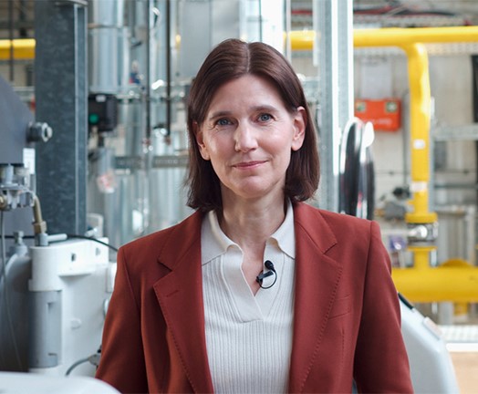
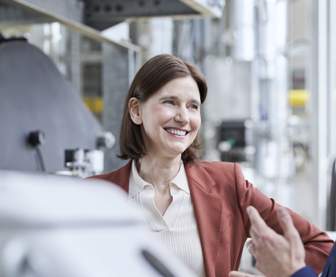
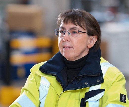
某个瞬间: Dr. Martina Gieg, 首席人力资源官及集团执行领导团队成员
叮!Martinas 今天的计划?完美安排。条理清晰。然而就在某个瞬间,突然发现:计划赶不上变化。如何让这种混乱的局面成为提升工作效率的催化剂?欢迎继续阅读!
-
-
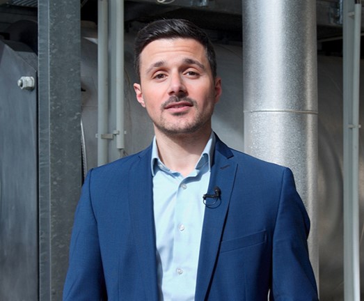
市场缺口: Arthur Charlet,Heraeus Medical 主管;Heraeus Medical 联席总裁
汽车行业的发动机开始卡顿。Arthur 当时在我们的生产驻地就经历过这样的情况。维持空转?不存在这个选项。只有换挡才能弹射前进,扭转乾坤。随我们来发现挑战是如何成就全新思维方式的。
-
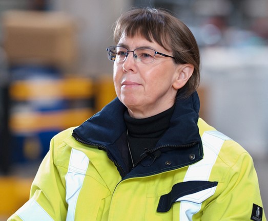
EHS 游戏化: Anja Teske 博士,HBS Corporate EHS 的 EHS 治理与绩效主管
您是否曾经通过讲述故事或设立大型游戏舞台,来达到深入人心的效果?Anja 选择的正是这条路。她旨在提高工作场所安全性的培训理念,依靠的是经验而非说教。在她的故事中了解为何她这样做效果最好。
-
您哪位啊: Dr. Martina Gieg, 首席人力资源官及集团执行领导团队成员
无论是谁,只要曾以顾问的身份穿梭于各个公司,对首先必须打破的第一道藩篱——“冷漠”都深有体会。居然还有其他办法?您可以在 Martina 的故事中了解她如何破解这一密码的。
-
沉默还是警示: Anja Teske 博士,HBS Corporate EHS 的 EHS 治理与绩效主管
有时候,需要外科手术般的精准表达才能指出错误的工作方式。语气不当可能会引发抵触情绪。反之,恰当的措辞能够挽救生命。关于职业安全中敏感的沟通艺术,向 Anja 了解更多知识!
-
工作和慢跑?每一步都意义重大: Arthur Charlet,Heraeus Medical 主管;Heraeus Medical 联席总裁
你听到了吗?这就是舒适区的节奏。舒适、安稳,却又令人不安地停滞不前——这就是 Arthur 的感受,于是他将自己的职业道路打造成一条个人慢跑路线。在我们的故事中您会发现慢跑鞋与成功之路之间有着惊人的相似之处!
-
在这里互相切磋: Arthur Charlet,Heraeus Medical 主管;Heraeus Medical 联席总裁
闯入未知领域——大部分人都有过这样的经历。 至少对于 Arthur 而言,他进入了一个全新的职业世界,并开始飞速进步。为什么往往最艰难的时刻却蕴藏着最宝贵的教训——阅读完整故事!
-
美好的结局: Dr. Martina Gieg, 首席人力资源官及集团执行领导团队成员
有些办公室就像是未曾书写的白纸。但不要被迷惑,因为生机勃勃的节奏正在这里默默涌动。这里简直就是一片绿茵场,蕴含了无法预料的可能性。来看看我们的集团人才官在这片不设限的运动场上的经历吧!
-
雷厉风行却不失真诚: Anja Teske 博士,HBS Corporate EHS 的 EHS 治理与绩效主管
一场险些发生的事故。一个统计数据。就只是纸面上的一个数字吗?大错特错。每一个得以避免的事故背后,都是今晚下班后可以平安回家的鲜活的人。让我们来认识一下我们的审核主管 Anja,她敢于换一个角度看待问题!
-
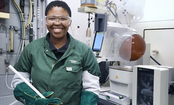
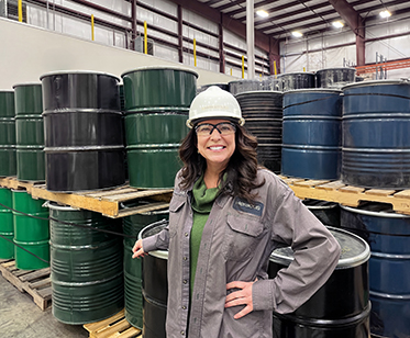
带伤上阵作战: Thembela Kwini,化学工艺操作员,贺利氏贵金属,HSA Gqeberha,南非
当职场遭遇悲恸,同情和人道主义往往是最有力的支持来源。在人生中最哀痛的时刻,Thembela 是如何面对的?以及,在团队成员深陷悲痛之时,她如何以坚韧力量和同理心与团队并肩作战。
-
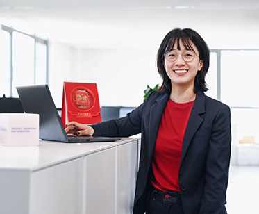
不可能的任务?在贺利氏,一切皆有可能:Angie,贺利氏(中国)业务应用顾问
有时,恰恰是那些寂静无声的时刻最意义非凡。一封电子邮件、一句赞赏,然后恍然领悟:非凡的成果往往诞生于看似不可能完成的任务。一起来看看 Angie 如何成功驾驭一个真实的项目挑战,并在此过程中实现了职业与个人的双重成长。
-
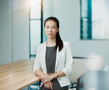
项目成功落地,最终荣耀加冕:Karen,贺利氏(中国)薪酬与福利人力资源经理
无论是在路上驰骋,还是在项目中冲刺,那种从零加速到一百的感觉总是无比特别。这需要勇气、耐力与技艺。而这正是 Karen 在贺利氏电子任职期间为贺利氏电子HET“能力发展屋”大型项目团队所带来的核心优势。这个故事讲述了她如何和团队一起将职场变为一个让愿景照进现实的地方。
-
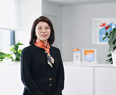
30 岁还有勇气重启人生吗?当然有:Karen,贺利氏(中国)人力资源经理
“我一直很钦佩那些能够运用专业知识影响他人认知的人 — 只是从未想过,有朝一日自己也能成为这样的人。”正是这份觉醒推动 Karen 从行政人员转型成为贺利氏大中华区区域中心的项目协调员。以下是她的蜕变之路。
-
当化学走进生产一线: Amit Kumar,贺利氏贵金属公司技术经理,美国加州圣菲斯普林斯
当化学走进真实世界,会带来怎样的改变?对 Amit 来说,答案就在生产一线。在贺利氏,他将专业的科学知识与跨团队协作紧密结合,专注解决那些迫切需要解决的问题。日复一如,从不懈怠。一起来了解他的故事!
-
当化学走进生产一线: Amit Kumar,贺利氏贵金属公司技术经理,美国加州圣菲斯普林斯
当化学走进真实世界,会带来怎样的改变?对 Amit 来说,答案就在生产一线。在贺利氏,他将专业的科学知识与跨团队协作紧密结合,专注解决那些迫切需要解决的问题。日复一如,从不懈怠。一起来了解他的故事!
-
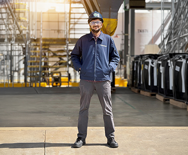
一辆卡车。八个流动料仓。简直让我欣喜若狂。Abbe Little,贺利氏贵金属
在我2023 年 7 月刚刚入职贺利氏贵金属时,回收厂的熔炼炉尚未完工。不到一年的时间,该设备便投入了运行——其采用的贺利氏技术在此类技术中乃全球首创。我肩负的使命非常明确:寻找客户。但当时并没有活跃的客户群,也没有可参考的成功案例。“我们需要自己创造市场”,他们说。而我手上,有的只是一张白纸。
-
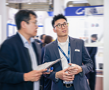
狐狸知道怎么办:“Marvin”,贺利氏电子客户经理
全新的视角足以改变一切。Marvin 带着工程师的底色投身销售领域。在贺利氏,他用行动证明:真正的成功不在于施加压力,而在于理解、连接,以及看清本质的能力。有时候,关键就在于找到那个能为你打开大门的人。让我们一同走进他的故事。


Job Alert New
Code Snippet:
- CMS - Section 4 - Content